
Getting Started
With AmpereUI you can kickstart your next project in just seconds
Just you need to add this link tag to you html and you will be good to go.
AmpereUI uses unicon icon for most of the places and
for some place it use fontawesome icon. You can however
use any of these at any places as per your convinience.
AmpereUI sets the base font size to 10px and hence
1rem = 10px. This is helpful in making the typography
and spacing responsive. So we would suggest you to keep your style
sheet also in terms of 10px as the base size.
Colors
AmpereUI comes with 10 different colors
We provide you with 10 different colors namely black,
pink, red, orange,
yellow, green, teal,
blue, indigo, purple. Each
color comes with 6 shade namely red-1,
red-2 and so on.
For background-color you can add the classes like
bg-red-1, bg-red-2 and so on for all the
different colors.
For font-color you can add the classes like red-1,
red-2 and so on for all the different colors.
Example of different color text using helper class
Red Text
Blue Text
Orange Text
Purple Text
Example of same color text with different shade using helper class
Indigo - 1
Indigo - 2
Indigo - 3
Indigo - 4
Indigo - 5
Indigo - 6
Example of different background color using helper class
Example of red color with all 6 shades
Example of red purple with all 6 shades
Typography
Let's talk a little bit about typography
Typography play a very important role in making your site look
aesthetic and giving the taste of your product. AmpereUI gives a all
the necessary helper classes needed for typography including
alignemnt, font-sizes,
font-weight, text-decoration and so on.
Headings
Hello World
Hello World
Hello World
Hello World
Hello World
Hello World
Font Weights
Black
Bold
Semi Bold
Medium
Regular
Light
Text Alignments
Left Text
Lorem ipsum dolor sit amet consectetur adipisicing elit. Cupiditate libero autem excepturi adipisci nemo rem provident facere officia tenetur eaque?
Center Text
Lorem ipsum dolor sit amet consectetur adipisicing elit. Cupiditate libero autem excepturi adipisci nemo rem provident facere officia tenetur eaque?
Right Text
Lorem ipsum dolor sit amet consectetur adipisicing elit. Cupiditate libero autem excepturi adipisci nemo rem provident facere officia tenetur eaque?
Font Style
capitalize
LOWERCASE
uppercase
Strike Text
Underline
Text Sizes
12px text
Lorem ipsum, dolor sit amet consectetur adipisicing elit. Perspiciatis nisi distinctio obcaecati magnam, a laboriosam dignissimos vel repellendus ex nihil.
14px text
Lorem ipsum, dolor sit amet consectetur adipisicing elit. Perspiciatis nisi distinctio obcaecati magnam, a laboriosam dignissimos vel repellendus ex nihil.
16px text
Lorem ipsum, dolor sit amet consectetur adipisicing elit. Perspiciatis nisi distinctio obcaecati magnam, a laboriosam dignissimos vel repellendus ex nihil.
18px text
Lorem ipsum, dolor sit amet consectetur adipisicing elit. Perspiciatis nisi distinctio obcaecati magnam, a laboriosam dignissimos vel repellendus ex nihil.
20px text
Lorem ipsum, dolor sit amet consectetur adipisicing elit. Perspiciatis nisi distinctio obcaecati magnam, a laboriosam dignissimos vel repellendus ex nihil.
24px text
Lorem ipsum, dolor sit amet consectetur adipisicing elit. Perspiciatis nisi distinctio obcaecati magnam, a laboriosam dignissimos vel repellendus ex nihil.
Spacing
Now it's time to take a look on spacing classes provided by the library.
About Margin
We provide all the necessary classes for padding and
margin.
The convention for margin on all side is
m-auto, m-0, m-8,
m-10, m-16, m-20 and
m-24.
The convention for margin-left on all side is
ml-auto, ml-0, ml-8,
ml-10, ml-16, ml-20 and
ml-24.
For margin-right, the convetion is
mr-auto and similar.
For margin-bottom, the convetion is
mb-auto and similar.
For margin-top, the convetion is
mt-auto and similar.
For margin-vertical, the convetion is
mv-auto and similar.
For margin-horizontal, the convetion is
mh-auto and similar.
Margin - Demo
Padding Demo
Avatars
Here are the examples of avatars with text.
You can simply add avatar class to a div and write the
text you want on the avatar ,.e.g AZ. We also provide
three variants for the avatars namely avatar-sm,
avatar-md and avatar-lg for different
sizes as per your need.
For the image avatar you can simply add the
avatar class on the image tag as hown in the below code
snippet. The size variation works with the image avatar too.
Alerts
Here are the examples of alerts.
For the alert you can simply add the
alert class in the div with icon of your choice as
shown in the below code snippet. In the icon you need to add the
class alert-icon to make it work.
There are four types of alerts , a basic alert with class of
alert, alert-primary,
alert-warning, alert-info,
If you want small alert you can alert-sm class to the
alert div and you will be good to go.
If you want to make alert with dismiss just add
alert-action class to the icon and add the javascript
code from below.
Badges
Here are the examples of badges on icon.
We also offer badges on icon components where you can either put count on the badges of you can put some icon also in the badges. Take a look below.
You can also change the color of the badge by simply adding color and bg color classes of your choice to the badge.
Profile with badges
Here are the examples of profile with badges
Cards
Here are the examples of vertical card.

The world of Turtle
By Discovery
Here are the examples of vertical product card.

XBox Controller
$19.90
$29.90Here are the examples of vertical card with dismiss.
Xbox Controller
$19.90
$29.90Here are the examples of basic vertical card.
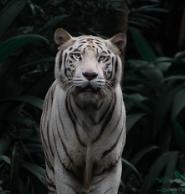
The World Of White Tiger
John Doe
Lorem ipsum dolor sit amet consectetur, adipisicing elit. Dolore, architecto.
Here are the examples of basic horizontal card.

The world of Turtle
By Discovery
Lorem ipsum dolor sit amet, consectetur adipisicing elit.
Here are the examples of horizontal product card.

Bose Headphone
$19.90
$29.90 NEW 10% OFLorem ipsum dolor sit amet consectetur adipisicing elit. Temporibus nisi unde mollitia iure impedit. Quos!
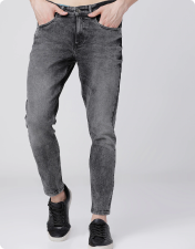
Here are the examples of horizontal product card with text overlay.
Roadster Blue Jeans
$19.90
$29.90 NEW 10% OFLorem ipsum dolor sit amet consectetur adipisicing elit. Temporibus nisi unde mollitia iure impedit. Quos!
Here are the examples of horizontal text only card
The Road Not Taken
by Mobashir FarhanLorem ipsum dolor sit amet consectetur adipisicing elit. Temporibus nisi unde mollitia iure impedit. Quos!
Here are the examples of small horizontal card
The world of Turtle
By Discovery
Lorem ipsum dolor sit amet, consectetur adipisicing elit. Sunt quaerat qui illum.
Here are the examples of small horizontal card
Roadster Blue Jeans
$19.90
$29.90Here are the examples of small horizontal product card with dismiss
Bose Headphone
$19.90
$29.90Here are the examples of small vertical product card for product listing
XBox Controller
Men Skinny Jeans
$19.90
$29.90Here are the examples of small vertical product for wishlist
XBox Controller
Men Skinny Jeans
$19.90
$29.90Here are the examples of small horizontal product card with quantity buttons
Roadster Jeans
Men Skinny Jeans
$19.90
$29.90Images
Here are the examples responsive image
For the responsive image just add img-res class to any
image tag. FOr round image add img-round in the image
tag.
Inputs
Here are the examples text fields
Here are the radio buttons,checbox, and range component
Text Utilities
Here are the examples text utilities
Heading H1
Heading H2
Heading H3
Heading H4
Heading H5
Heading H6
Center text
Lorem ipsum dolor sit amet consectetur adipisicing elit. Porro quod harum a accusantium autem quam sapiente sit? Quos, praesentium doloremque.
Left text
Lorem ipsum dolor sit amet consectetur adipisicing elit. Porro quod harum a accusantium autem quam sapiente sit? Quos, praesentium doloremque.
Right text
Lorem ipsum dolor sit amet consectetur adipisicing elit. Porro quod harum a accusantium autem quam sapiente sit? Quos, praesentium doloremque.
This is bold text
This is semi bold text
This is medium text
This is regular text
This is light text
Lists
Here are the example of lists
We offer three types of list , a basic stacked no bullet list, a no
bulleted list with icon which is unicon by default. It
also comes with a inline spaced list.
- Item 1
- Item 2
- Item 3
List title
- Item 1
- Item 2
- Item 3
List title
- Item 1
- Item 2
- Item 3
Modal
Here is the example of modal
Are you sure ?
Do you really want to delete ?
Rating
Here is the example of rating component
By default the star style is grey. If you want to add the active
style add the star-active class to thei tag containing
the star icon.
Toast
Here is the example of toast
Toast comes with without action button as well as with action button. It has four variation basic toast, success toast, warning toast, and info toast and all are fullt configurable where you can use any icon of your own choice and add or remove action button. For the dismissal of toast add the js code from the below.
For positioning of the toast you can add the following classes
namely top-left, top-right,
bottom-right, bottom-right.
Message not sent
Your message has not been sent
Successful
You can now check your mail
Request failed
Please try agian after sometime.
Request failed
Please try agian after sometime.
Grid
Here is the example of grid system
We offer a very basic 4 column grid system where your simply give
the grid-component class to the parent and you get a 4
column grid.
Now in order to make your children take space according to you, your
can add the children with classes like span-2 to take
space of two children, span-3, for three children and
span-4 for all the four children.
Below is the example of all the use case possible with our 4 column grid.
For a responsive 4 column grid add the class
grid-component-responsive to the parent and when the
screen size become smaller it will become a 2-column grid.
For a stacked 4 column grid add the class
grid-component-stacked to the parent and when the
screen size become smaller it will become a stacked